How to Use the Psychology of Color to Increase Website Conversions
By Rustin Banks
Source: KissMetrics – blog
Color wields enormous sway over our attitudes and emotions. When our eyes take in a color, they communicate with a region of the brain known as the hypothalamus, which in turn sends a cascade of signals to the pituitary gland, on to the endocrine system, and then to the thyroid glands. The thyroid glands signal the release of hormones, which cause fluctuation in mood, emotion, and resulting behavior.
Research from QuickSprout indicates that 90% of all product assessments have to do with color. “Color,” writes Neil Patel, is “85% of the reason you purchased a specific product.” It’s a no-brainer fact of any website that color affects conversions. Big time.
So, the bottom line is: use the right colors, and you win.
What is Color Psychology?
In order to really appreciate the tips below, you’ll benefit from a little information on color psychology.
Color psychology is the science of how color affects human behavior. Color psychology actually is a branch of the broader field of behavioral psychology. Suffice it to say that it’s a pretty complicated field. Some skeptics are even dismissive of the whole field of color psychology, due to the difficulty of testing theories. My own research on the topic, as this article conveys, lacks scientific evidence to back up every claim. But that alone is no reason to dismiss the profound and unarguable effect that color has on people.
There are key facts of color theory that are indisputable. In a peer reviewed journal article, Satyendra Singh determined that it takes a mere 90 seconds for a customer to form an opinion about a product. And, 62-90% of that interaction is determined by the color of the product alone.
Color psychology is a must-study field for leaders, office managers, architects, gardeners, chefs, product designers, packaging designers, store owners, and even expectant parents painting the nursery for the new arrival! Color is critical. Our success depends upon how we use color.
Where Should You Use Color?
Let’s get oriented to our context. Since color is ubiquitous, we need to understand where you should use these color tips. This article discusses the use of color in website design. Specifically, we’re talking about the color scheme of a website, which includes the tint of hero graphics, headline type, borders, backgrounds, buttons, and popups.
In the example below, NinjaJump uses a green-yellow-red color scheme in their logo, phone number, video C2A, menu bar, graphics, category menu, sub headings, and sidebar. The tips that we discuss below can be applied in similar ways — menus, sidebars, color schemes, etc.
Using the Right Color in the Right Way
Color is a tricky thing. You have to use it in the right way, at the right time, with the right audience, and for the right purpose.
For example, if you are selling bouncy jump houses — those things that kids play in — you don’t want to use a black website. Props, NinjaJump.com.
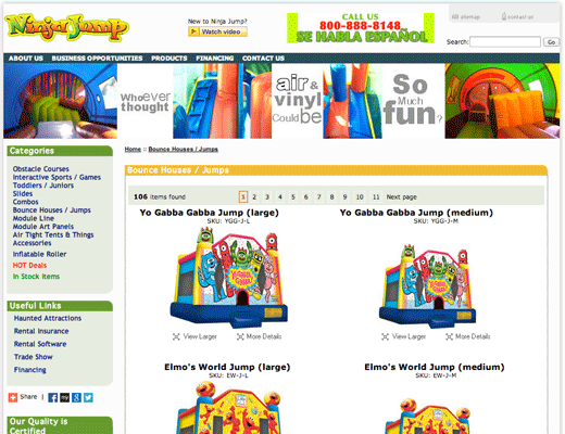
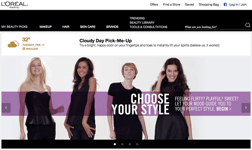
For the jump house site, you want lots of bright and vibrant colors, probably some reds, greens, and maybe a splash of yellow for good measure. If, on the other hand, you’re selling a product to women, you don’t want to use brown or orange. Maybe that’s why L’oreal uses black and white, with purple overlay, in their e-commerce homepage.
I’ll explain all the tricks below. In order to succeed at using the right color psychology, you need to follow these core principles:
The right way
The right time
The right audience
The right purpose
Here are some tips that the pros use when dealing with conversions and color.